
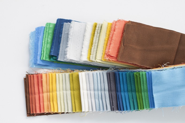
Getting the chance to put together a coordinating set of Kona cotton solids to go with my collections is always a treat. I like to use it as an opportunity to build out the color range of the line further rather than try to match everything perfectly.
Here’s a flashback to that process. First, I like to order the collection in some way by color. Then I’ll start to think about how to fill in and expand on any gaps with the solids.
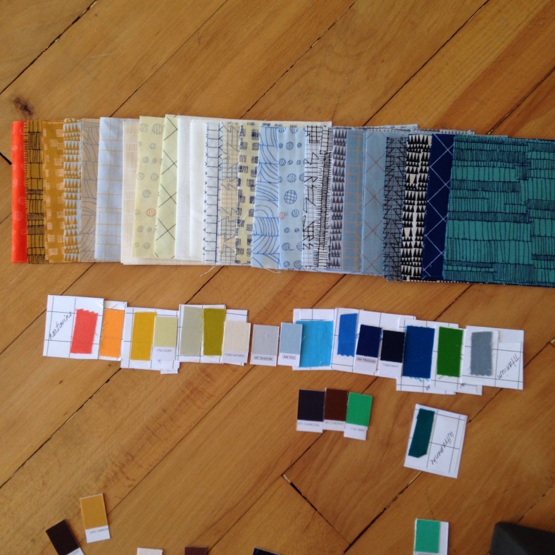
Here are the colors that made the final cut. (See here for the names.)
In other news, this also happened.
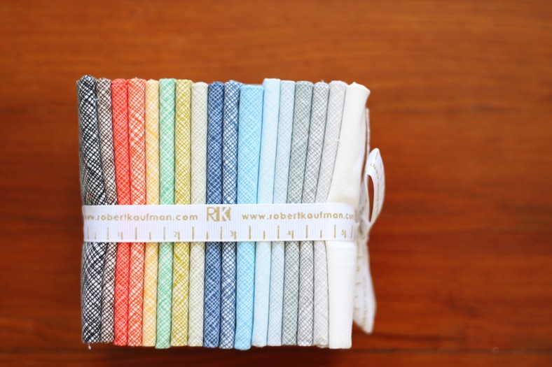
I was able to add some new colors to the Architextures crosshatch print. New to the group are shades of Chestnut, Poppy, Pickle, Limestone, Cadet, Niagra, Fog, Shadow, and Shale. The pic above shows one of the new FQ bundles that has all of the current and available colors in it.
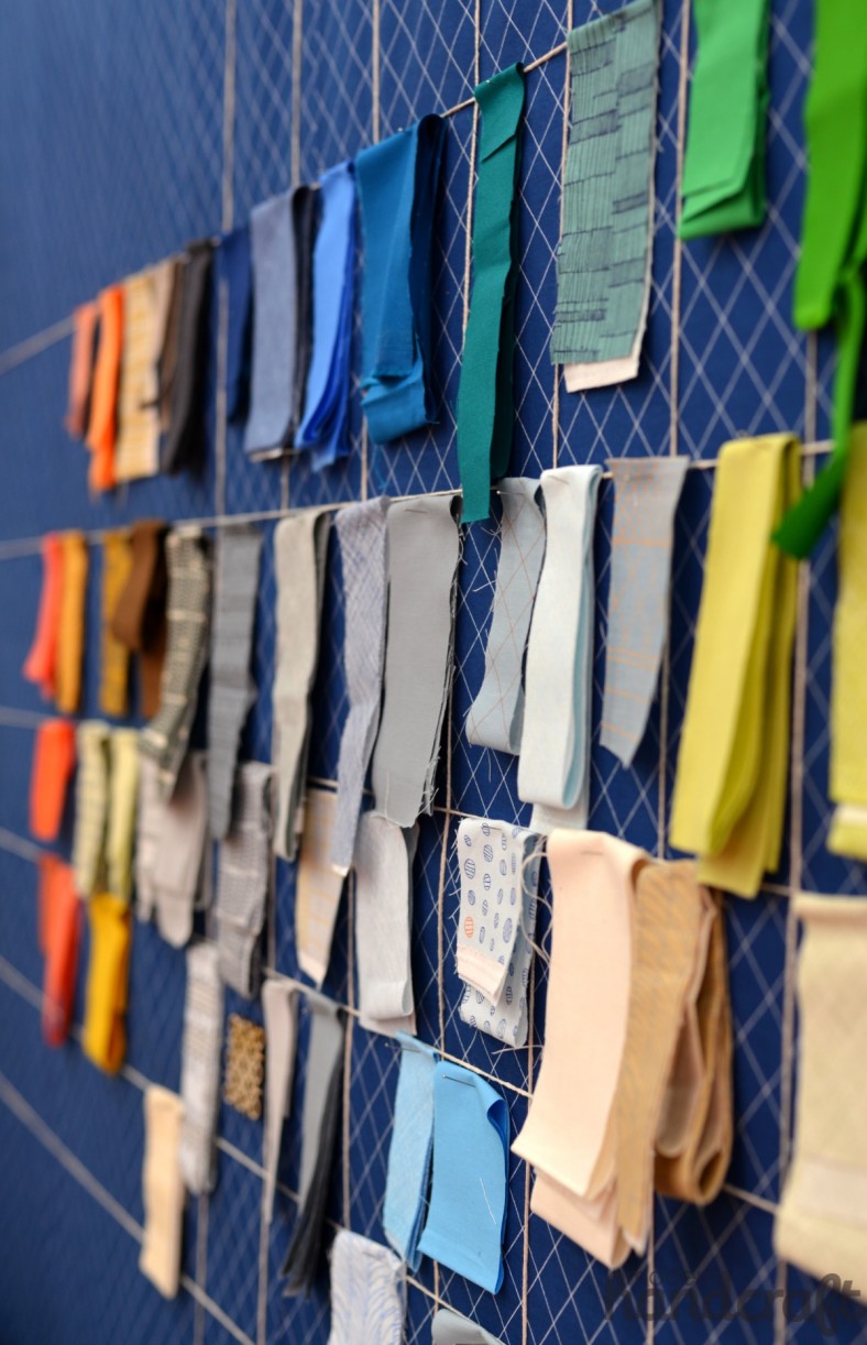
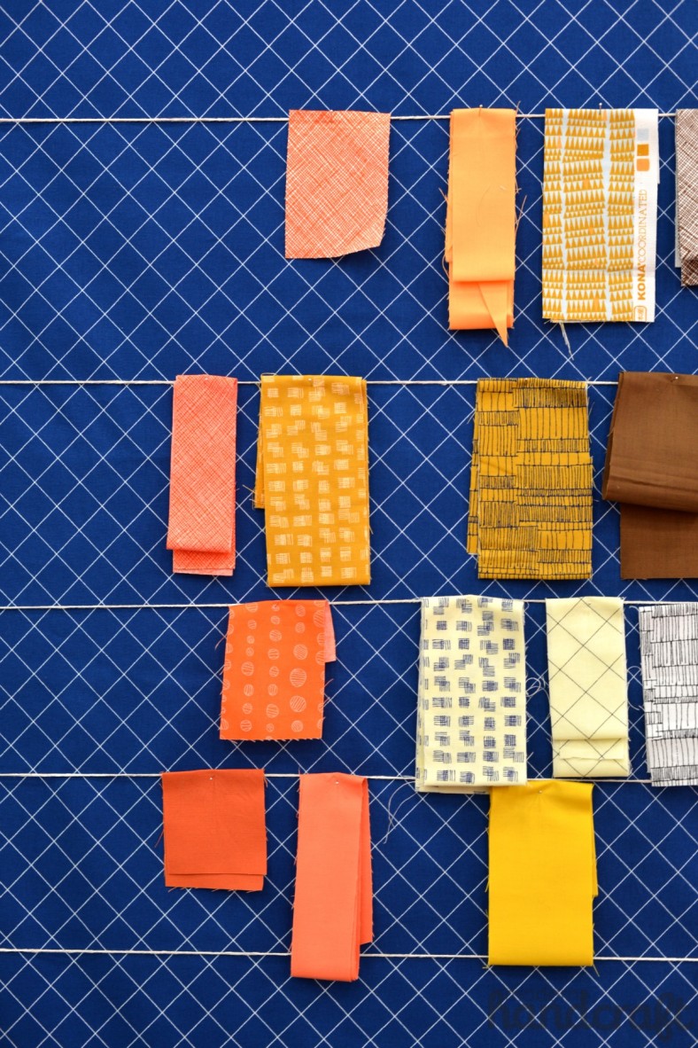
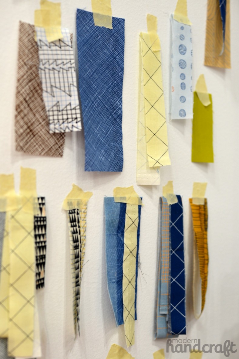
Related to swatches and solids, I thought I’d also highlight another section of my booth, which was my smaller swatch wall. One of the first things that I did with Doe was to play around with how the different prints, coordinating solids, and extra crosshatch colors would play together. Anytime that I had a swatch set that I liked, I’d pin it up on my studio wall as a reminder for later. I wanted to bring this element into the booth, and so I had some extra swatches at play on my small side wall. (Big thanks to Nicole at Modern Handcraft for letting me use some of the great pics that she took in my booth! To check out her Market recap of my booth or to see any of her other beautiful posts, visit here.)
#alltheprettykonas
#doefabric
#doevember
Leave a Reply